Basics of color theory
Color theory is a complex field of study in visual arts. It may sound intimidating, especially if you are getting started in the world of painting. But don’t worry, this article will provide you with the basics of how to combine colors in order to express yourself and make your paintings look more harmonious. Let’s start!
Firstly, what is color?
If you have ever visited the ocean, you might have noticed that waves come in different sizes. Some can be large enough to make a ship roll. Others are so small that just make the surface look rough. Light behaves in the same way. Our eyes are constantly catching light in different “sizes” or wavelengths, which are interpreted as colors by the brain. However, our eyes do not perceive every color that we actually “see”. Only three wavelengths can be perceived directly. When combined, the brain is able to infer the other ones. For this reason, color models in visual arts are usually based in three primary colors. Traditionally, the most extended color model in painting has been the RYB model, which combines Red, Yellow and Blue in order to reproduce the whole spectrum.

Understanding the color wheel
The color wheel is a tool that allows painters to understand better how to obtain different colors. Primary colors (red, yellow and blue) are placed evenly spaced in the wheel. By gradually moving from a primary color towards another, secondary colors are obtained. For example, orange is obtained by gradually moving from yellow to red, or vice versa. Secondary colors (orange, green and purple) are placed midway between primary colors. Of course, other colors can be obtained by moving between primary and secondary colors. These are named tertiary colors.

Color harmony
In music, different notes can be played at once in order to make a chord. In a similar way, painting’s esthetic involves using different colors within a same piece of art. Not every combination of colors looks good, as not every combination of notes sounds good. This is where the study of harmony takes place. Although color harmony has many details to explore, here are a few important concepts that will help you understand it:
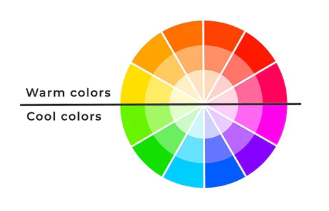
- Warm and cool colors: Divide the color wheel in halves. Warm colors are those sitting in the half that contains red, orange and yellow. They are usually associated with strong feelings, such as joy, anger and passion. Cool colors, such as green, blue and purple, are placed in the other half, and are associated with mild feelings, such as serenity and sadness.
- Complementary colors: These are placed at opposite sides in the color wheel (e.g., orange and blue). Complementary colors provide maximum contrast and can be used to produce a sense of variation or heterogeneity.
- Analogous colors: These are placed next to each other in the color wheel. Analogous colors can evoke some comfort and homogeneity, as they provide low contrast.
- Triadic colors: Any three colors that are evenly spaced in the color wheel are called triadic colors. Primary and secondary colors are good examples. Compared to complementary colors, triadic colors provide less contrast but may feel more diverse.


Brightness and saturation
Black, white and gray are “special” colors that cannot be obtained from a color wheel. This is because they actually represent the combination or the absence of primary colors. When including these in the equation, the color spectrum can be expanded. Brightness is a measure of how “shiny” something looks. For any color in the color wheel, brightness can be raised by adding white and reduced by adding black. On the other hand, saturation is a measure of how concentrated a color is. Saturation can be decreased by adding gray. By playing with brightness and saturation, you can make your paintings more dynamic!


Differences in brightness Differences in saturation